We discussed how the Northern Lights are created and why there are different colors in the sky. We watched a video of the Northern Lights dancing across the night sky. They thought it was so cool! Using chalk pastels, students created their own Northern Light background. We then added a black silhouetted landscape over top. Some students decided to add stars to their picture while others did not.
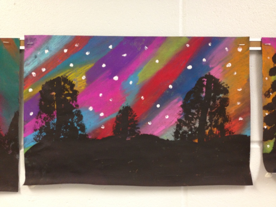
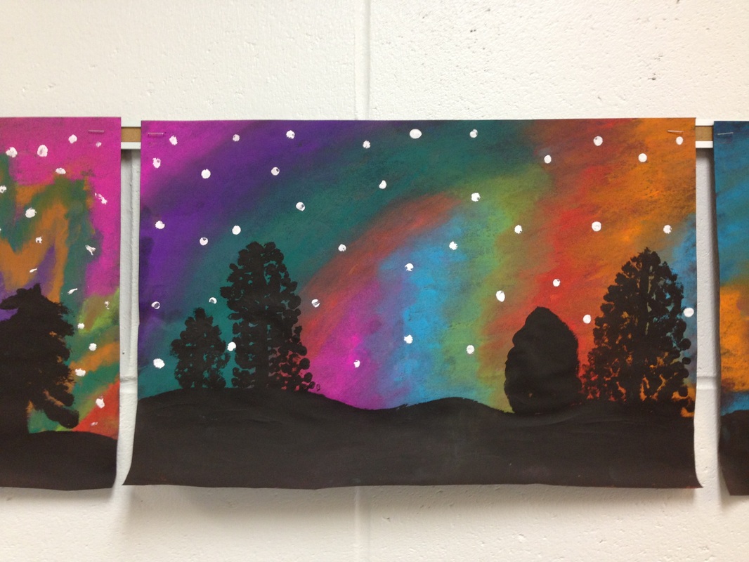
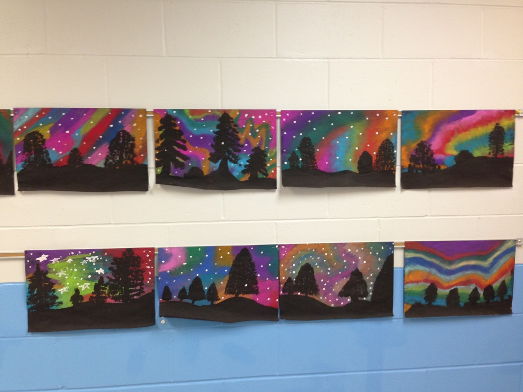
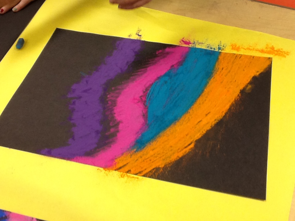
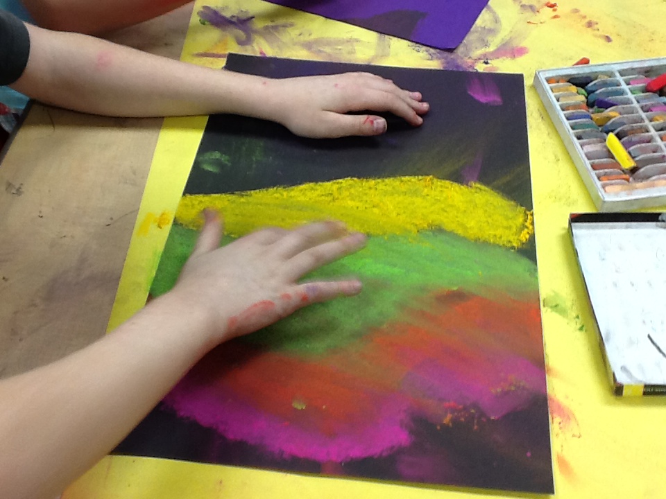
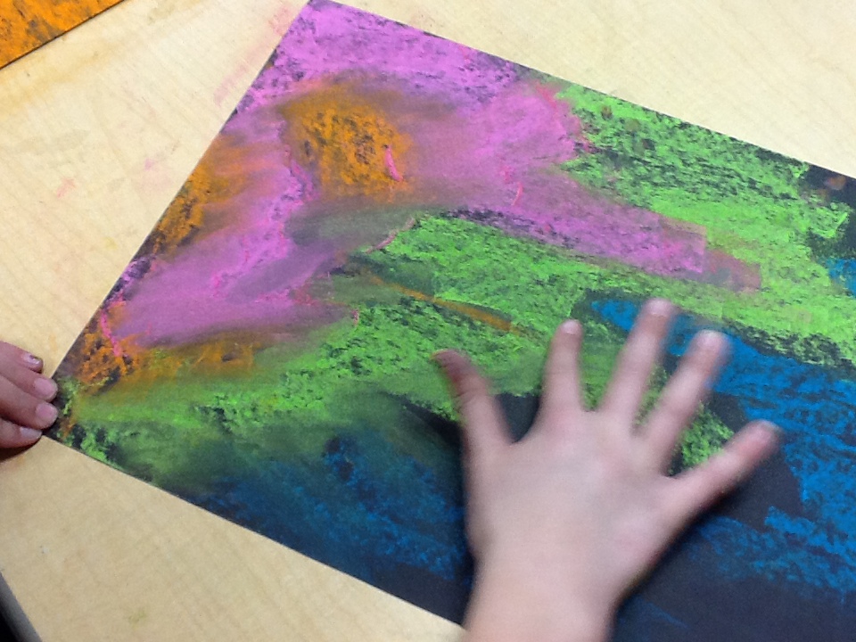
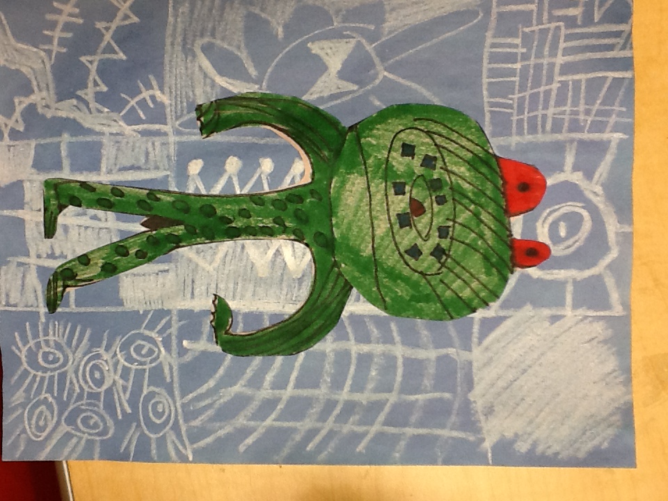
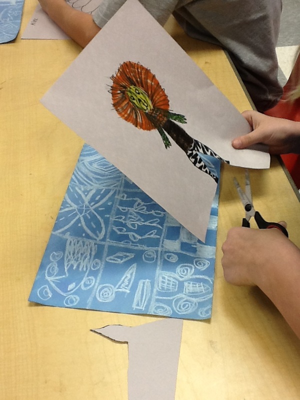
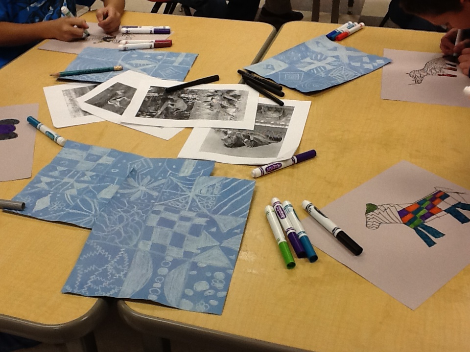
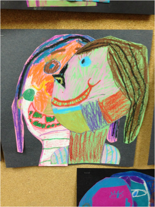
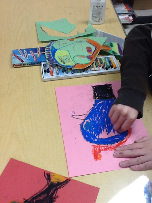
The 5th grade classes created these lovely pieces of art work based off of the Northern Lights!
We discussed how the Northern Lights are created and why there are different colors in the sky. We watched a video of the Northern Lights dancing across the night sky. They thought it was so cool! Using chalk pastels, students created their own Northern Light background. We then added a black silhouetted landscape over top. Some students decided to add stars to their picture while others did not.
11 Comments
The 3rd grade classes made coil pots! Here are some pictures of them glazing their projects as well as some pictures of their finished projects.
5th grade students created Adire Eleko cloths with stylized animals!
Students learned about different types of African art, Adire Eleko cloths being one of them. These cloths are made to be worn around the body. Paste is used to draw on images to a cloth and then the cloth is dipped into a blue dye. Once the dye dries, the paste is scraped away leaving white designs behind (because the paste resists the dye!). We discussed how a resist works and then we used white crayons on blue construction paper to create patterns like those used on Adire Eleko cloths. Then students used blue watercolors to paint over top, kind of like dipping an actual cloth into blue dye. They watched as the wax crayon resisted the watercolor. While those were drying, students then learned about the different animals in Africa. They drew these animals in a stylized/simplified way adding patterns on top. They cut out their animals and glued them down on top of their Adire Eleko cloth. 3rd grade students learned about the artist Pablo Picasso! We discussed how he created portraits in a new way. Students used mirrors and partners to draw a frontal self-portrait as well as a profile portrait. They used oil pastels to draw and color. They were encouraged to use bold colors just like Picasso. Students then cut out both portraits and glued the frontal portrait down first and the profile portrait down second.
I was inspired by the above image by Luke Dixon (found on http://bldgwlf.com) which I found while browsing the internet one day. So I decided to create a drawing project from it!
Students in my drawing class had previously used the grid method in order to draw out an image, erase the grid, then add value to create a realistic drawing. The lesson we did after that one was a Pop Art Andy Warhol inspired project where students outlined each and every change in value and re-drew it 4 times. THIS project combined both! We gridded out the image they chose (preferably a person or movie figure) and then outlined each value change. They then re-drew their grid on a new piece of paper and then transferred the blobs of value from the original image onto their fresh gridded paper (instead of drawing each realistic line). See some of the works below if this sounds confusing! Once students had their image re-drawn, they used sharpies to go over their pencil marks, and finally added contour lines to create some value. As anyone can see by the first image below....my very first quarter of teaching ceramics was pretty much a disaster. We had SO MANY problems! The clay would dry out, then it would be too wet, I couldn't figure out how to run the kiln (glaze wouldn't turn, then it was too hot and melted everything), projects falling apart...you name it and it happened. It was a nightmare. But it was also a learning experience.
Here are some pictures from first quarters ceramics class...lol. I don't have many pictures because, as stated above, not many things turned out well. BUT! Second quarter of ceramics has gone SO WELL! I will get some pictures from that class posted soon! The 2D Art class worked very hard to create an image that could only be fully seen from one spot (one perspective). I found this lesson (which was called "localized perspective") on another art website and decided to give it a spin!
The students looked at various art works that require the viewer to stand an one spot to see the full picture. Check out these artists if you're interested:Marco Cianfanelli, Markus Raetz, Shigeo Fukuda, Gillian Brown. Students were broken up into groups of 3-4. They chose a simple image to work with and drew that image onto a clear transfer sheet. They then chose their area to work: corners, stairs, hallways, anywhere that would challenge their image. They then had one person stand with the view finder (transparency sheet with image drawn onto it) on an X where every viewer would have to stand to see their full image properly. That person then directed the other members where to put the blue painters tape in order to create the outline to their image! The 2D class worked on a project that involved the idea of creating a balanced composition. They did not have to use the same elements to create balance, they could if they wanted to. We discussed symmetrical balance and asymmetrical balance. Then students got a 9x9 inch piece of white paper on which they drew out their elements (lines, shapes, patterns, etc.). They were encouraged to draw images inside of other images as long as no lines were touching each other.
Once students were done drawing, they used exacto knives to cut out each element. They flipped the elements inside and out to create a shadow effect as well as to create the balance we were looking for. This project had many layers to it. First we discussed abstract art and how it does not have to show anything in particular. So the first layer that the students were instructed to do was to choose a color scheme and paint their entire paper with shapes and lines in anyway they wanted. The second layer was to outline their shapes with either white or black depending on their colors and what would look best. The next layer was to add different types of funky paper over top. Lastly students cut their painting apart in 3 inch squares and then reassembled it onto a new piece of paper. And there you have your abstract collage.
Okay. So sadly I only have to examples from this lesson :( With all of the shuffle of being a K-12 art teaching and running between two buildings...I must sadly admit the high schoolers don't get as many pictures taken by me as they should. I will get better though!
Anyway, in this lesson the students got to choose an image that they enjoyed (something they really wanted, so I let them loose). Many chose to do cd covers or logos. We discussed Andy Warhol and his use of popular images and the colors that he chose to use. The students had to copy their image 4 times and color each one using a color scheme. Each one could be a different color scheme or they could all be similar. Then they cut each image to be the same size and glued them down to a black paper for a background. |