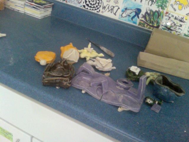
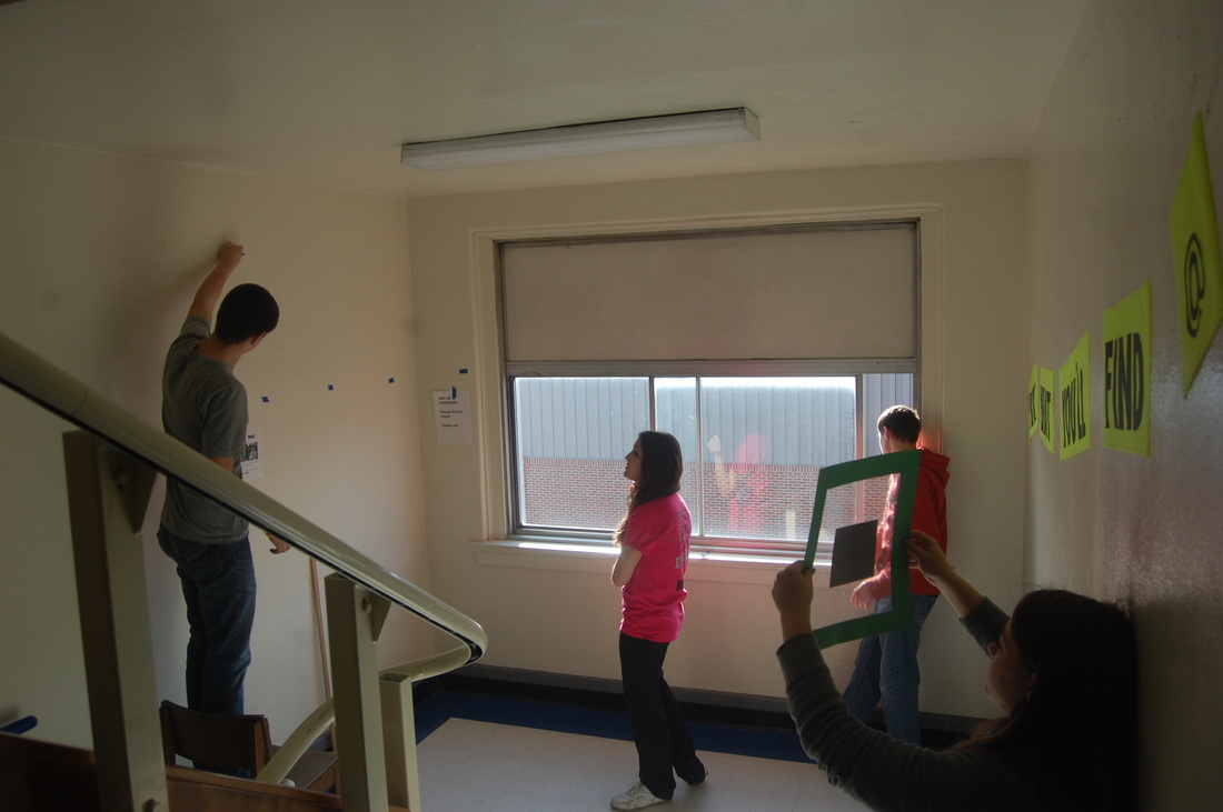
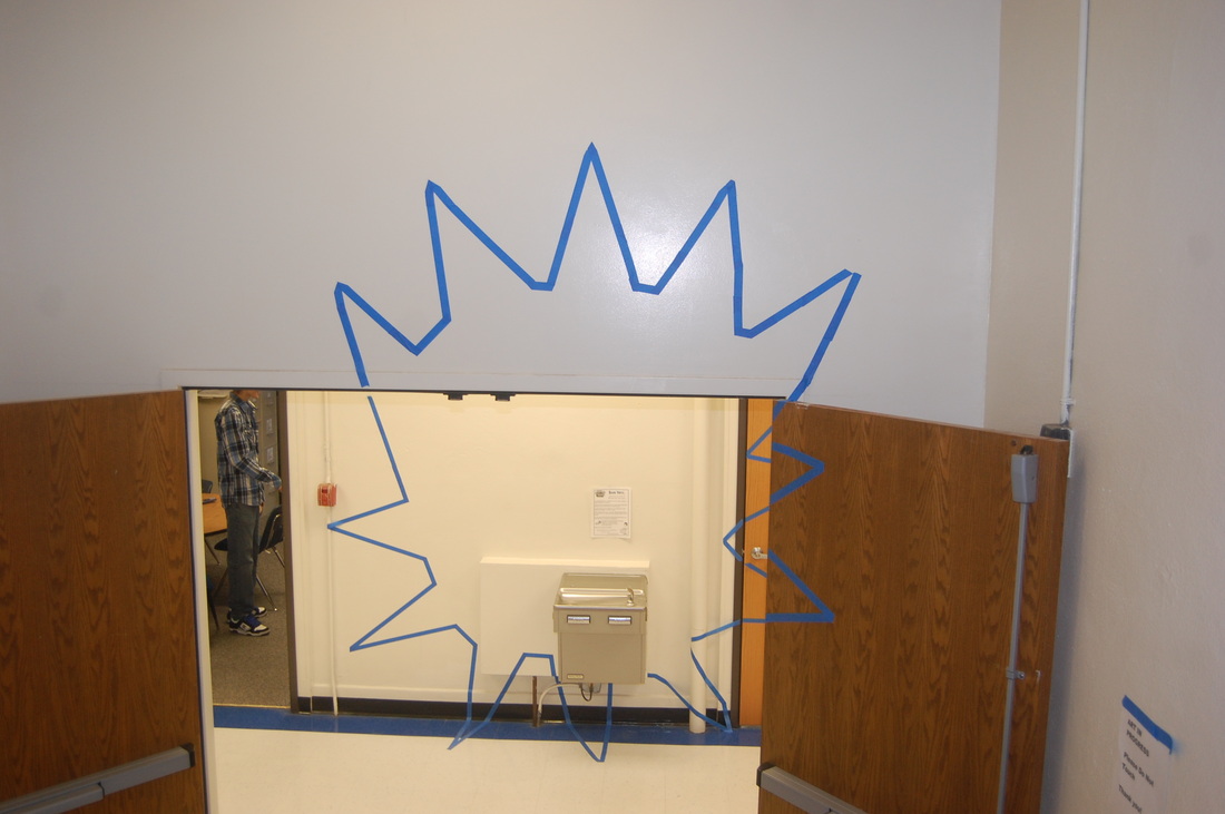
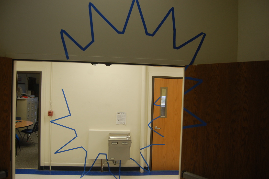
As anyone can see by the first image below....my very first quarter of teaching ceramics was pretty much a disaster. We had SO MANY problems! The clay would dry out, then it would be too wet, I couldn't figure out how to run the kiln (glaze wouldn't turn, then it was too hot and melted everything), projects falling apart...you name it and it happened. It was a nightmare. But it was also a learning experience.
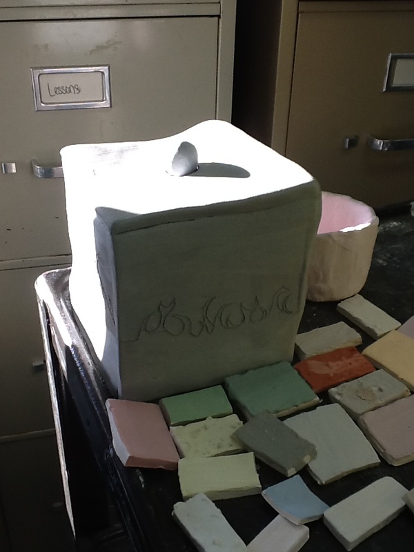
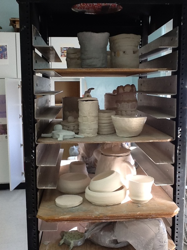
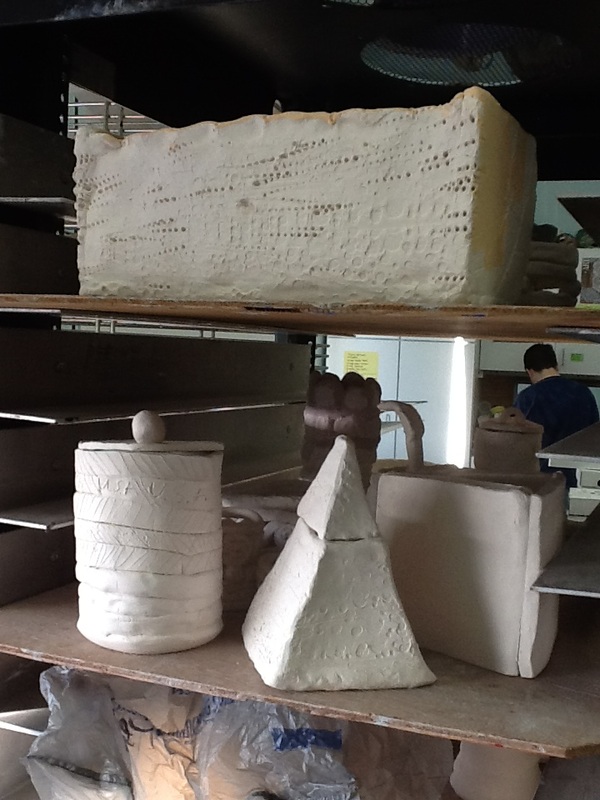
Here are some pictures from first quarters ceramics class...lol. I don't have many pictures because, as stated above, not many things turned out well. BUT! Second quarter of ceramics has gone SO WELL! I will get some pictures from that class posted soon!
Here are some pictures from first quarters ceramics class...lol. I don't have many pictures because, as stated above, not many things turned out well. BUT! Second quarter of ceramics has gone SO WELL! I will get some pictures from that class posted soon!
 RSS Feed